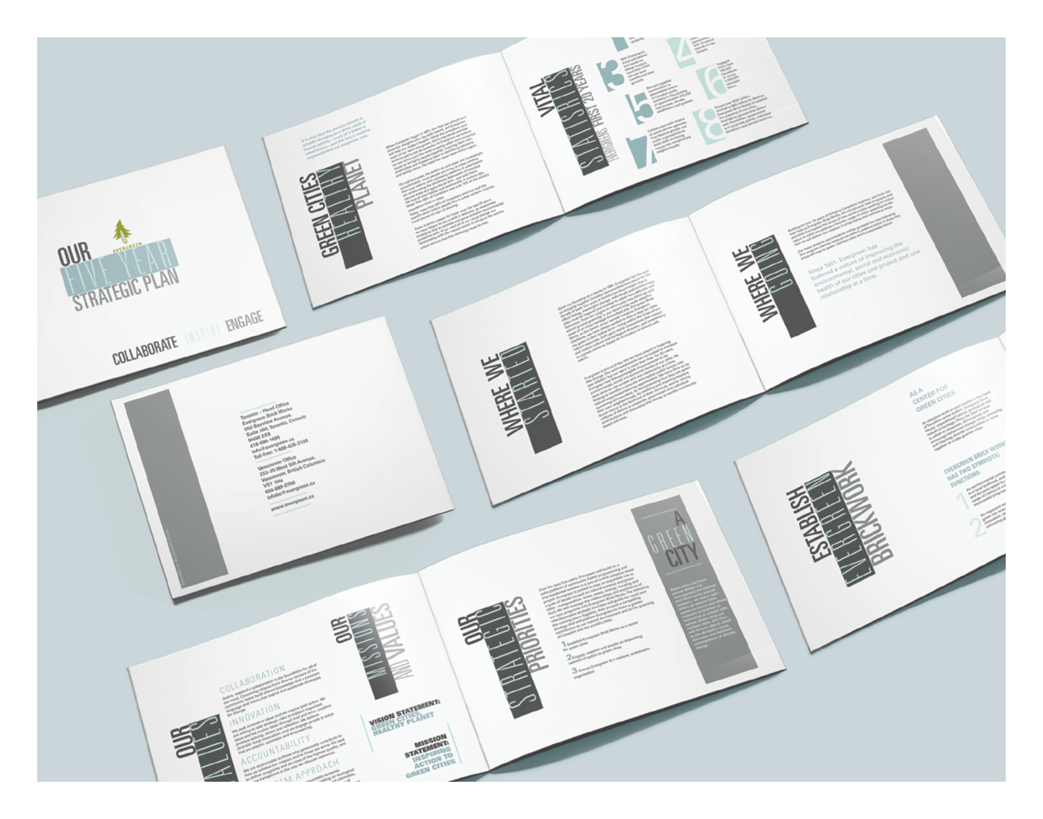

I used a blue and grey colour scheme to complement the Evergreen name. By using different weights of the typeface throughout, along with complementary colour scheme, I highlighted each section differently. My goal was to emphasize the company’s mission and values while making it interesting and easy to read.