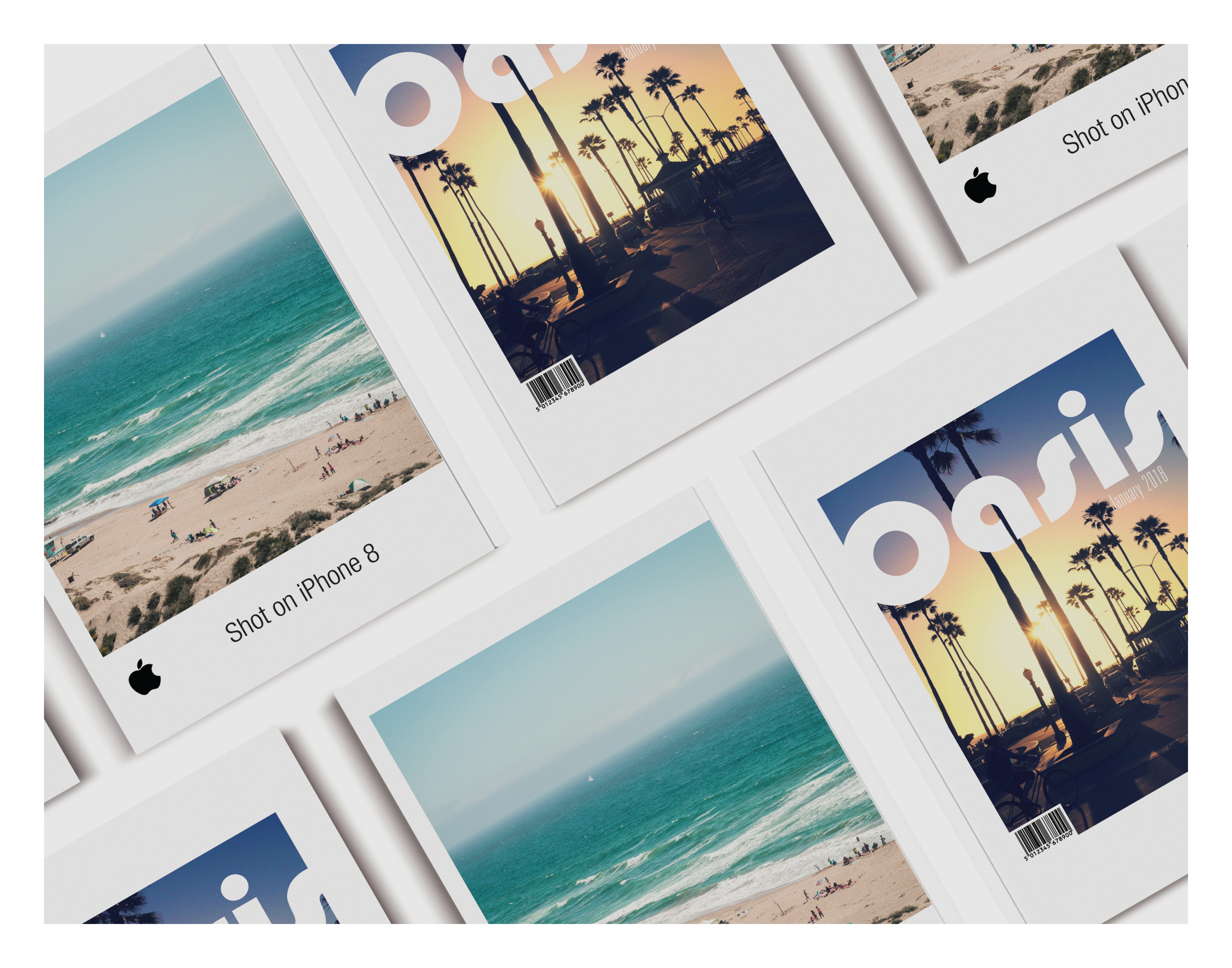

I designed a travel magazine called “Oasis” that revolves around my love for traveling and experiencing different cultures. To create a visually captivating experience, I opted for a pastel color scheme that exuded a sense of serenity and tranquility. The use of soft hues enhanced the overall aesthetic appeal.
In order to emphasize the content, I strategically utilized white space throughout the magazine’s layout. This minimalistic approach allowed the images to take center stage, capturing the readers’ attention and immersing them in the captivating destinations showcased within the publication.
Typography played a pivotal role in conveying the significance of each feature. I carefully selected fonts that not only complemented the overall design, but also enhanced the storytelling aspect of the magazine. From elegant headlines to clean and readable body text, the typography added a touch of sophistication to the publication.
Overall, “Oasis” strives to transport its readers on a visual journey that celebrates the beauty of traveling and the diverse cultures we encounter along the way. With its pastel color palette, minimal layout, and thoughtful typography, the magazine aims to inspire and spark a sense of wanderlust in its readers.